The problem
CustomInsight is a SaaS survey company whose core business is employee engagement, 360 feedback, and DEI surveys for corporate clients. School climate and culture surveys were one product line in that portfolio, and the company wanted to grow it. The problem was that a school district evaluating a survey vendor should not have to work out what a product built for them is doing inside a site built for HR directors.
The answer was a dedicated site for the education market: its own audience, its own language, its own conversion logic, while the parent brand kept serving its corporate customers. That meant competing directly with larger, better known providers in the K-12 space. Administrators there are spending public money on something they cannot touch or test first, which makes credibility a design problem before it is a marketing one.
Two structural failures had to be solved. Content buried what the product actually offered, so an administrator could not quickly answer basic evaluation questions. And there were no consistent moments to convert. Nothing carried a visitor from "this looks relevant" to "I want to talk to someone." Interest arrived and left without a trace.
My role
I built the site from scratch. There was no existing property for this market, no template to inherit, and no established visual direction for the sub-brand, so every decision started from the business goal rather than from what was already there.
I researched the competitive set to understand how established K-12 providers present themselves and where the gaps were. Before any design work began, I ran multiple sessions with the client team to clarify business goals, define the target audience precisely, and agree on core messaging. I worked directly with their content lead to shape the copy alongside the structure, because on a lead generation site the words and the layout are doing the same job and cannot be designed separately. The visual direction came out of several rounds of concepts and feedback with the client before we committed.
Design decisions
Structure the site around how administrators actually buy
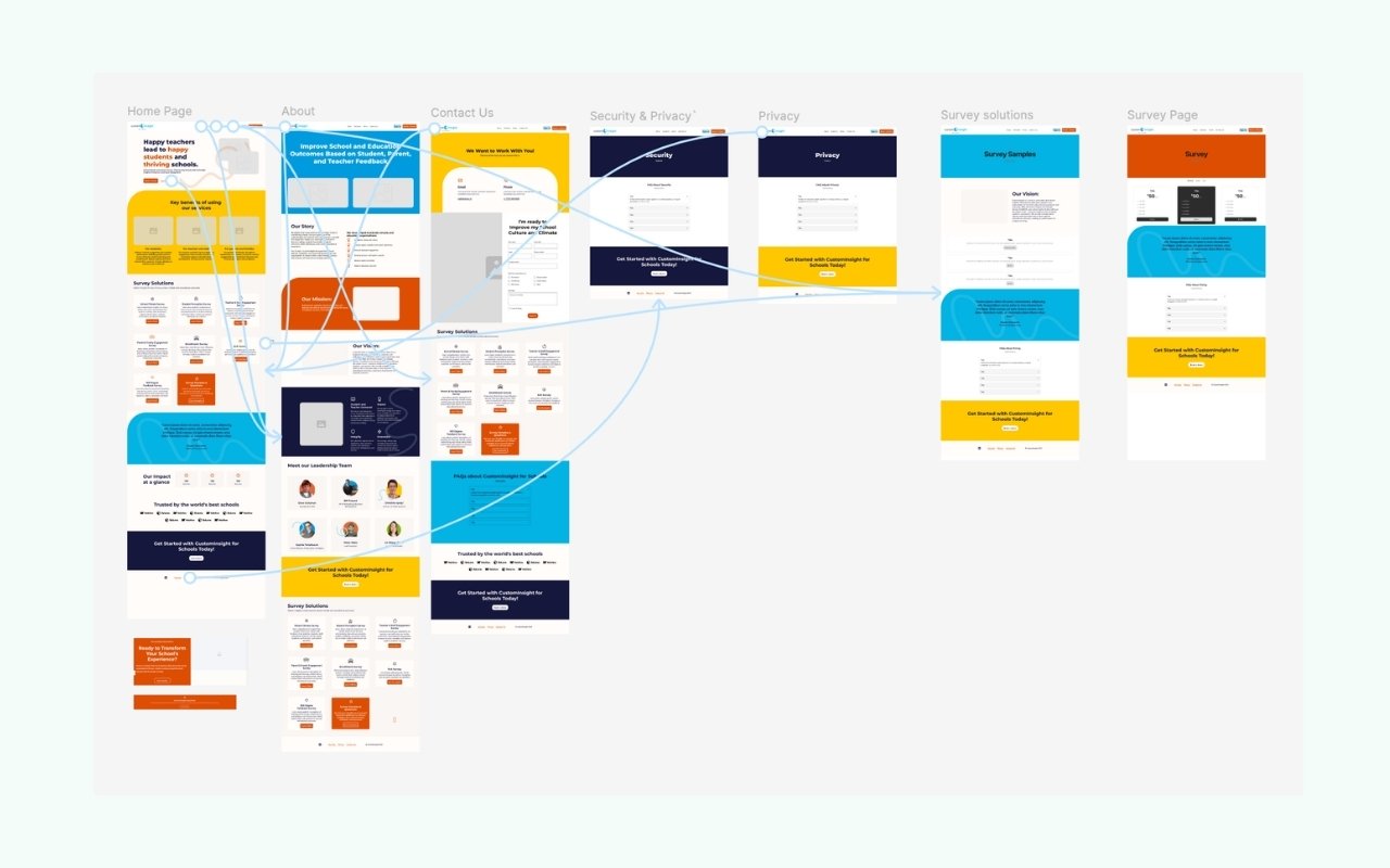
School leaders evaluate a service in a predictable sequence: What does it do? Who is it for? What does it cost? How do I start? The site answers those questions in that order, with a conversion moment placed at each natural decision point rather than a single contact page at the end. If someone is convinced on page two, the site should let them act on page two.
Gate the one thing prospects most wanted to see
The sample surveys were the highest-intent content on the site. Anyone asking to see the actual questions is not browsing, they are evaluating. I designed those samples as a gated download: a short email form in exchange for the full set. That single decision turned the site's most valuable page from a passive resource into the company's primary lead source, and it qualified the leads at the same time, because the people who fill out that form are already deep in the decision.
The design judgment was in the calibration. Gate too little and you capture nothing. Gate too much and you insult a busy administrator who just wants to know whether you are serious. Enough of the sample stays visible to establish credibility; the complete set is what asks for the introduction.
Close the credibility gap with structure, not decoration
Reading as an established provider is not a matter of looking expensive. It comes from answering questions before they are asked, showing the work rather than describing it, and being consistent enough that nothing feels improvised. Clear hierarchy, straightforward language, and a coherent visual system did more for the company's perceived scale than any amount of visual flourish would have.
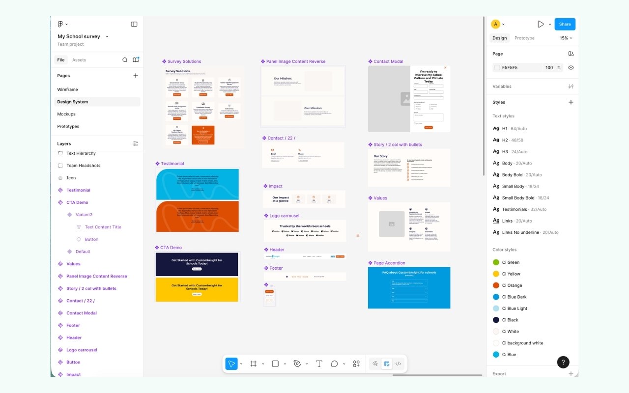
I translated the strategy into wireframes, high fidelity mockups, and a reusable Figma component system that scales across pages and screen sizes. New sections get built from existing components rather than commissioned as bespoke design, which is what keeps a site consistent after the designer leaves.
Outcome
The site gives school administrators a clear picture of the product and a frictionless path to reaching out. The structure supports lead generation by design rather than working against it, and the gated samples give the company a steady stream of contacts who have already shown real intent. Live at myschoolsurvey.com.
What I'd carry into a larger team
The hardest work on this project happened before Figma opened, in the conversations that clarified what the site actually needed to do. That does not change with scale. A bigger company has more audiences, more products, and more internal opinions, but the discipline is the same: agree on who you are talking to and what you want them to do, then let structure carry the argument.
The other transferable piece is that conversion design and brand design are not separate crafts. The gated download worked because the surrounding experience made the company feel worth trusting with an email address. Credibility is what makes a call to action convert, which means the brand work and the growth work are the same work.
And a sub-brand is its own design problem. Serving a new audience well means letting that audience have its own voice, structure, and proof points, while the parent business keeps its identity intact. Getting that balance right is the difference between a market expansion and a confusing second website.