A homepage has one job: tell the right person what they need to know in the first ten seconds. PSI’s old homepage was doing that for no one. The redesign wasn’t about making it look better — it was about making it work harder for three distinct audiences simultaneously, within a rebrand, inside a CMS.
The Problem
The old psi.org homepage had accumulated decisions over years without a coherent strategy behind them. A rotating image carousel buried the lede. Impact numbers — PSI’s most compelling proof points — were small, mid-page, and visually cluttered. The “Our Focus” section used vague labels over dark photography that communicated almost nothing to someone unfamiliar with PSI’s work. There was no global network visualization, no clear path for donors, and no meaningful distinction between what a partner, a donor, or a job seeker should do next.
Clarity used on the old page confirmed what the design made obvious: users were not scrolling past the fold in meaningful numbers. The page wasn’t earning attention; it was losing it.
My Role
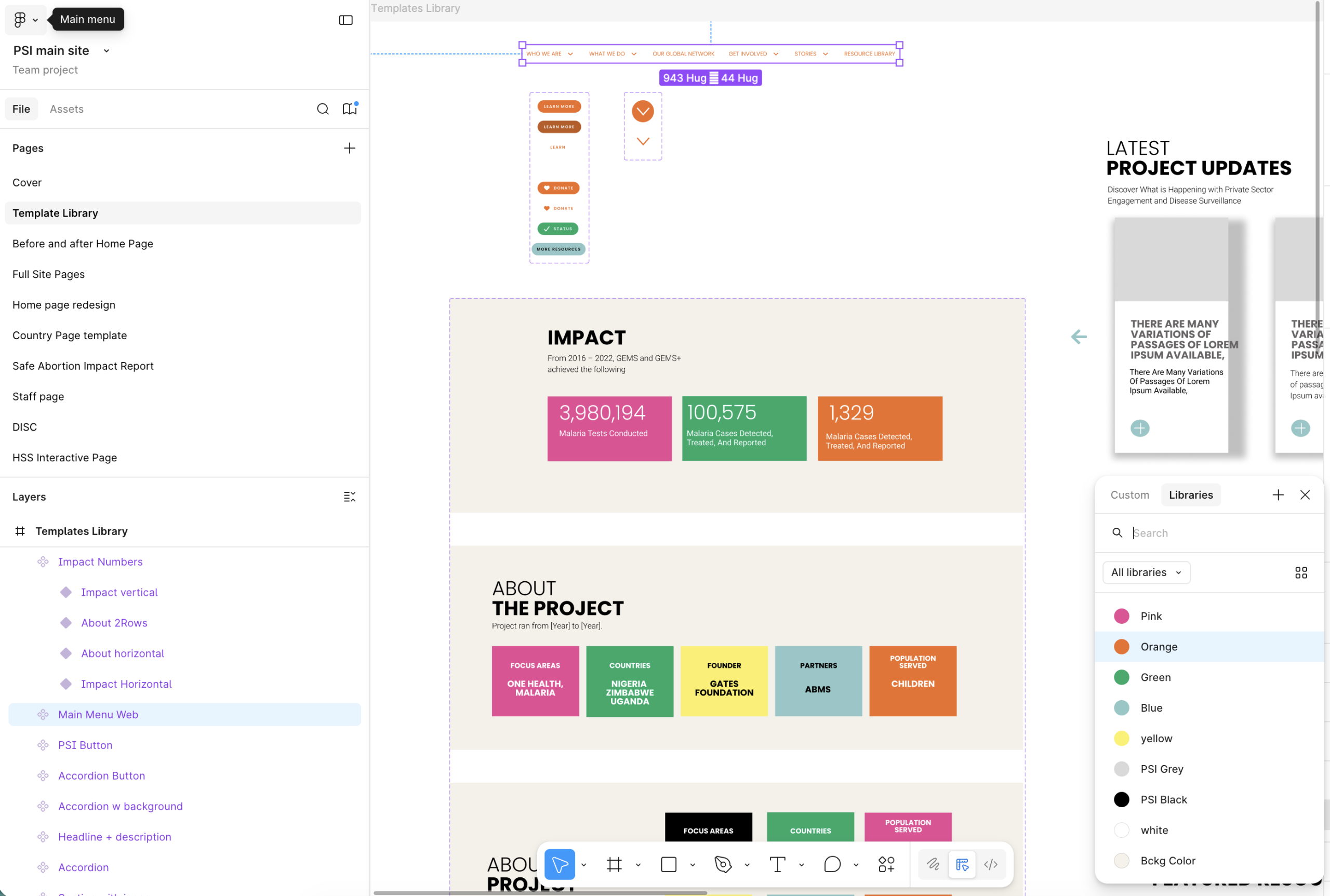
I led the redesign from audit through implementation — using behavioral data to diagnose the existing page, presenting multiple concepts to leadership before landing on a direction, and building the final designs in Figma before implementing in WordPress with Elementor. I maintained a live annotation layer in Figma throughout the process, documenting design decisions, open questions, and rationale as they evolved — so stakeholders could follow the thinking, not just see the output.
Design Decisions
- Replaced the multi-publisher carousel with a controlled hero — a single compressed video and headline slot with locked specifications, consolidating ownership and eliminating the performance bottleneck at its source.
- Restructured the information architecture so the mission statement and a band of global impact figures sit above the fold, answering “who is this organization” and “at what scale do they work” before the first scroll.
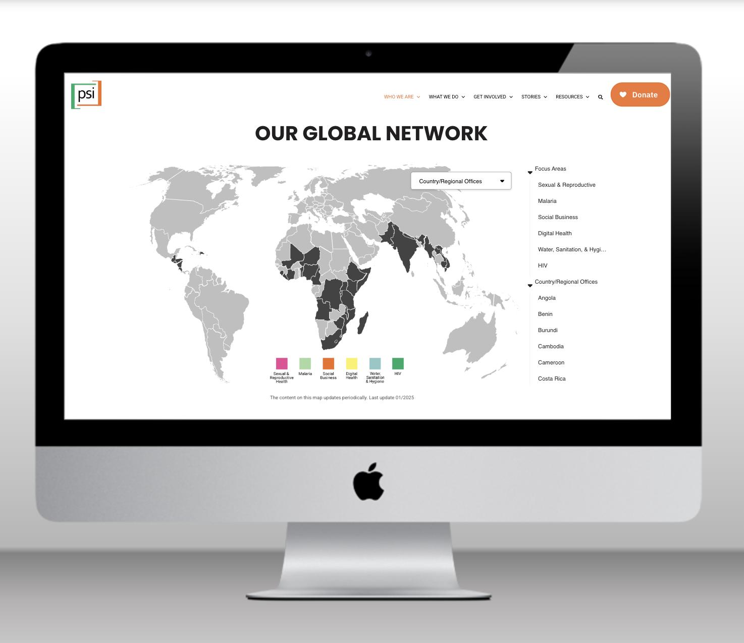
- The global network map, which I had already designed and shipped as a standalone product, was integrated directly into the homepage as the “Our Global Network” section. This was a systems decision: the map existed, it worked, and embedding it here gave the homepage depth without requiring new design work. The two projects reinforced each other.
- Embedded an inline donation form directly in the homepage layout, removing four steps from the path between a high-intent visitor and the first form field.
- Promoted careers and partnerships to dedicated homepage real estate based on analytics, which had flagged careers as one of the highest-traffic destinations on the entire site with no homepage presence.
- Integrated a live LinkedIn component so the homepage reflects real-time activity without anyone manually maintaining a “latest news” section — applying the same principle underneath every other decision: design something that doesn’t depend on someone remembering to update it.
Throughout the process, I flagged unresolved decisions in the Figma annotation layer: where to place the careers link, whether the partnership page needed introductory copy before the options, how to handle the YouTube video link relative to the hero. These weren’t oversights. They were open questions surfaced deliberately for stakeholder input rather than resolved unilaterally.
Outcome
The redesigned homepage stays aligned with the team behind it, not through manual policing, but because the constraints that protect it are built into the components themselves. Performance is predictable, the brand reads as cohesive, and conversion paths the data had flagged as underserved now have intentional homepage real estate. This case reflects my approach to design leadership: treating the design system as a product in its own right, aligning conflicting stakeholder priorities into a coherent layout, and using systems thinking to navigate operational complexity rather than only visual complexity.