The problem
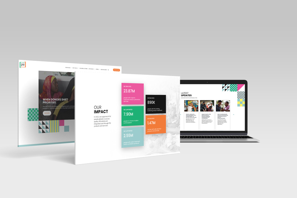
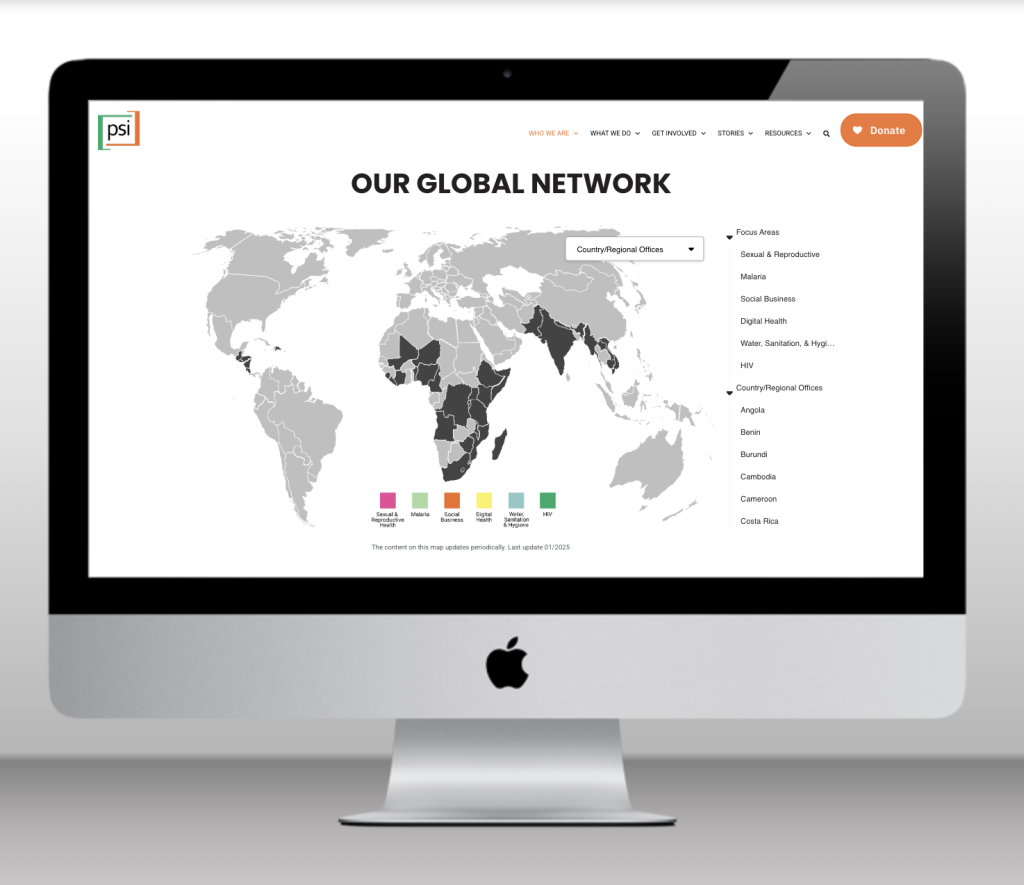
PSI operates in 40+ countries across Africa, Asia, and Latin America, but had no way to communicate that presence visually on psi.org. Country-level work lived in static decks and internal reports. Donors, partners, and the public had no way to explore the network or understand what programs existed where.
My role
I led the design end-to-end: defining the information architecture, determining which data to surface for each country in collaboration with program and communications stakeholders, and designing the full UI in Figma. I partnered with a developer for implementation, working within WordPress constraints throughout.
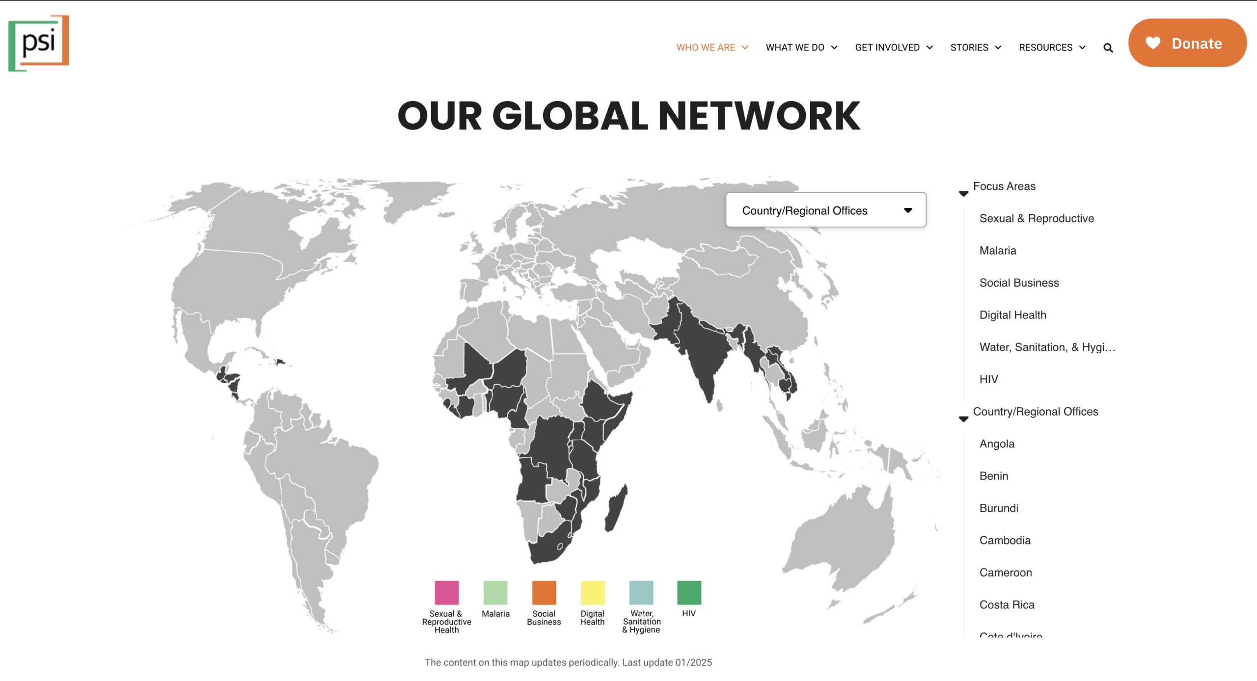
Design decisions
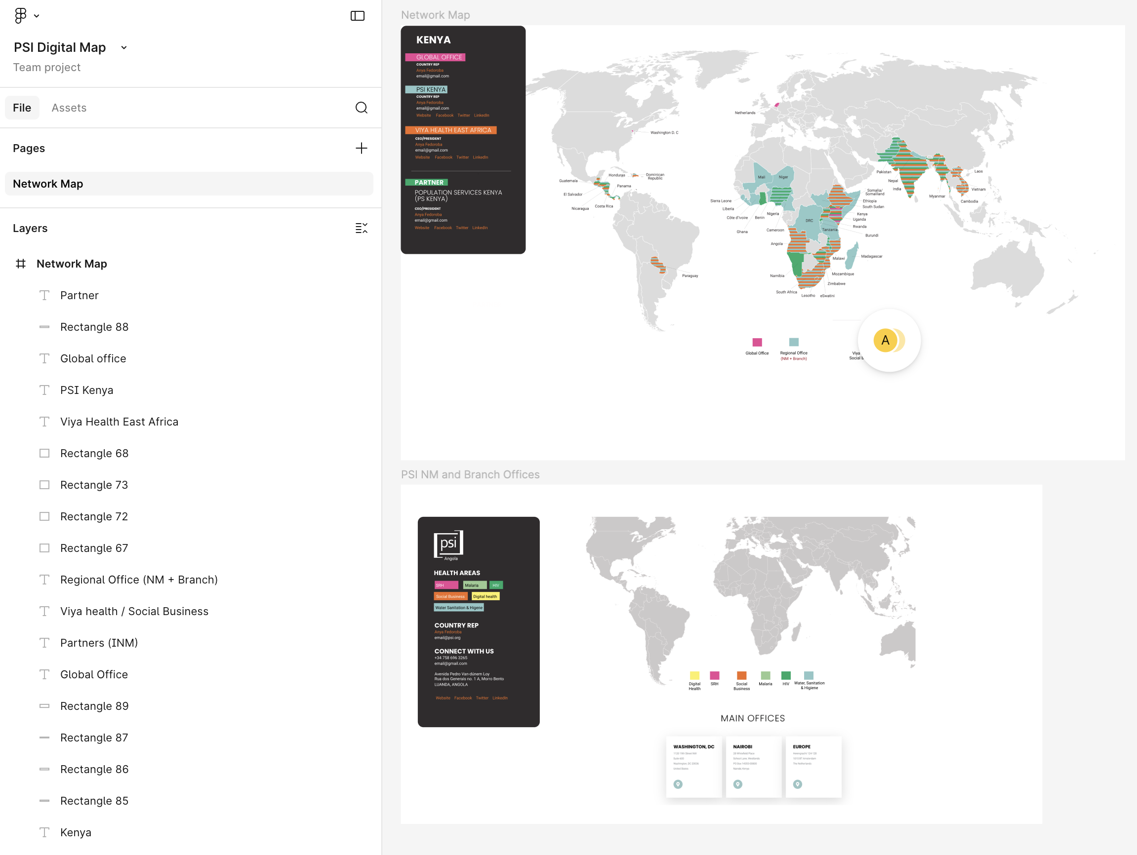
The core challenge was information density. PSI works across multiple health areas per country, and surfacing that without overwhelming users required real prioritization. Working with stakeholders, I established a three-level hierarchy: global view → regional filter → country detail on click.
The click behavior wasn’t the original design. I initially built country detail cards that appeared on hover, which felt natural in Figma. After shipping, I used Microsoft Clarity to record how stakeholders actually navigated the map — and the hover cards were triggering constantly and unexpectedly as people scanned the map. The interaction felt noisy and disorienting. I redesigned the cards to appear on click only, which gave users control and made the map significantly easier to read at a glance.
I also designed three map views serving different audiences: the full global network, an SBU breakdown, and NM/Branch Offices — each scoped to a different organizational use case.
What didn’t ship
One map view was designed but never built due to budget constraints: a version showing office type per country — distinguishing global offices, independent network members, and network members — using color-coded stripes on each country. The Figma spec exists; implementation was deprioritized. This is a common reality of product work inside resource-constrained organizations, and it’s worth naming honestly in a portfolio: scope decisions and tradeoffs are part of the job.
Outcome
The map is live on psi.org/our-global-network and is now the primary way PSI communicates its global presence to external audiences — donors, partners, and prospective staff and partners.